You don't have to be from Blackrock to realise all that awaits you on your doorstep in the Cork suburb.
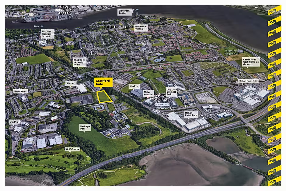
Conveniently located just off the N40, with easy access to the M8, N25 and N28, this is an area which is close to so many services and amenities but still manages to retain the charm of a village.
There's plenty of pubs, restaurants, shops and services nearby while Cork city centre is just a short stroll away.
You wouldn't think it when you arrive at Crawford Gate however.

Located just off the Skehard Road, this new estate from DOB Developments is situated on lands at Mahon Peninsula which offer a very tranquil and peaceful setting. Bordered by the Blackrock Walkway, magnificent hardwood trees and just opposite Bessboro's Sacred Heart Convent, you can see at once that it is an idyllic, quiet setting to live in.
When the properties were launched last year DOB Developments co-director Shane Keogh said: "Our aim is to deliver affordable, great quality homes that give purchasers the ability to live and work in the city, without compromise."
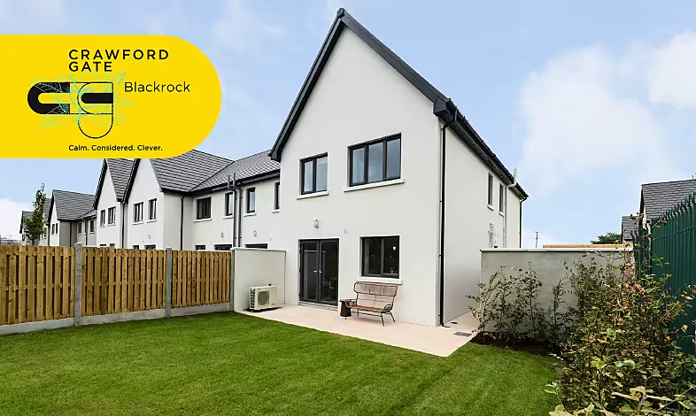
Crawford Gate, which will eventually consist of 65 homes across its 3.8 acres, certainly ticks all those boxes.
Sales have been brisk to date via Casey & Kingston estate agents and it's easy to see why after being shown around the three show houses by selling agent Jennifer Roe.
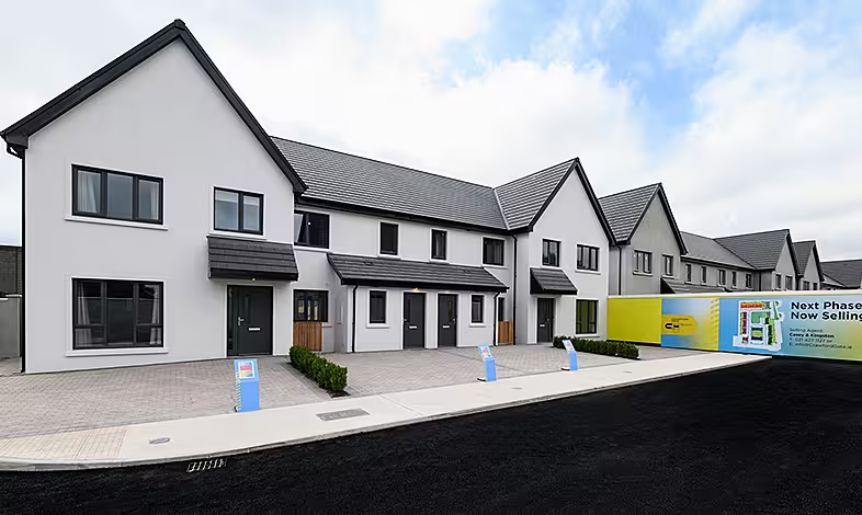
Each of the show houses have been immaculately laid out by Lauren Martin and Louise Rankin of Dublin-based design studio North Design.
The houses themselves were designed by Paul Mulligan of Reddy Architecture and construction is traditional block, with prices including fitted kitchens, tiling, built-ins and a finish of the very tasteful Colourtrend Temperance paint throughout. A Stira is also provided to access the floored attics giving very valuable extra storage space.
One neat feature to the front of the terraced properties is an enclosed space to house your bins, keeping them in a handy location but out of sight as you approach the front door.
The first of the individually designed show homes that we enter is the spacious four bed. The moment you step inside the first thing that hits you is the warmth of the home, assisted by the heat pump system and A3 rating which means these properties will be much cheaper to heat than anything you're likely to have experienced before.
The warmth of the house is helped by the flooring and tiles, all of which have been supplied by Right Price Tiles. For this show house, the ground floor is a laminate flooring 12mm AC5 board in 'New York Oak'.
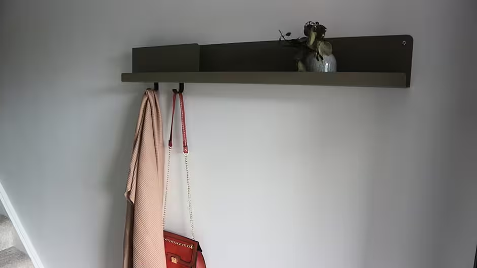
Having soaked this up, there's a trendy but practical coat hanger/shelf from Colonel to hang up your coat opposite a stylish mirror sourced from Pieces.ie which reflects the sunshine which greeted us on the day of our visit through the space and into the kitchen/dining area.

Lauren of North Design told us that these items were two of many affordable pieces throughout the homes.
"We thought it was a bit different to your typical hallway console table and lamp," she said of the hallway's setup.
"Although the hallway is spacious in this house we didn't want to enclose it by adding a console table so we played with the idea of a coat hanger/shelving unit with a mirror to reflect and bounce the light in the space.
"We sourced the mirror in the hallway from Pieces.ie, a gorgeous home wear shop owed by Grainne and Arthus located on George's Street in Dublin and the shelf is from Colonel a lovely online French homewares store.
"A lot of the pieces throughout the houses are high-street brands. It was important to create a longed after look within each house but also for it to be affordable and achievable to potential buyers. We are always conscious to design show houses that are affordable, otherwise you are selling a dream that is out of reach for most," she said.
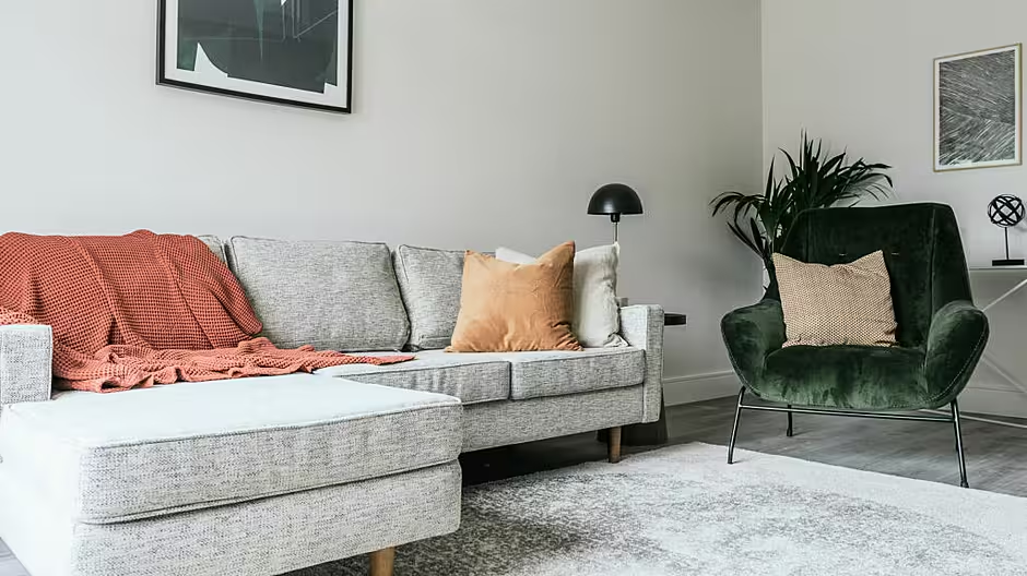
The "longed after look" is certainly achieved when we enter the living room, which you can immediately see yourself relaxing in after a long day. The sofa from made.com has a comfortable look about it and is made all the more appealing courtesy of pillows from Zara and H&M's Home range and a cosy rug from Ikea.
Lauren explained that all of the items in the living room were once again available to everyone.
"The living room pieces are a mix of high-street brands," she said.
"One thing we tend to do when using high-street brands is to mix them in a way that they are not so recognisable as so. For example there would be alot of Ikea items mixed throughout but it's done in a way that it doesn't end up looking like an Ikea showroom, which is important.
"The sofa in the living room is from made.com, the armchair is from Pieces.ie, the rug is IKEA and the cushions are a mix of Zara Home and H&M Home along with the ornaments.
"The white console table is from an Irish supplier WooDesign, it's an online store but they have a warehouse here in Ireland. The side table is from Habitat and the mushroom black side table lamp is from Abigail Ahern."
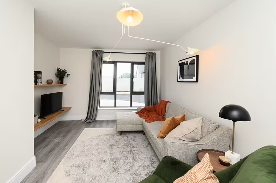
One of the key features of the room, however, is the stunning ceiling light.
Louise from North Design explained: "We find the best way to zone and cocoon a space is with lighting. It's a brave piece but in the soft white colour it works well and compliments the space whilst adding that edge. This particular piece was sourced from the client's lighting supplier Cork Lighting in Cork but many different suppliers do variations of it, for example Bluesuntree and Meadows and Byrne."
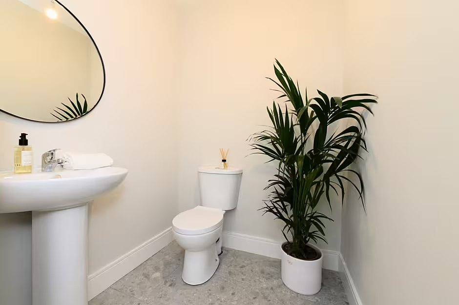
The downstairs of the property also has a WC and plant room, which offers ample storage space, but the real eye catcher is undoubtedly the kitchen, which offers a utility space off it.
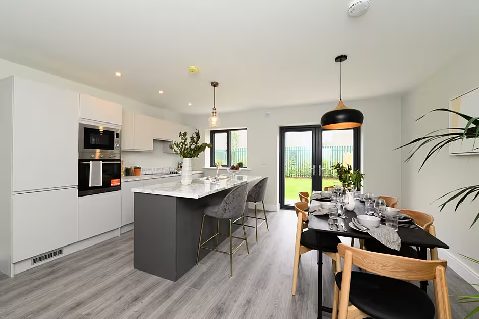
The kitchen, which boasts a stylish island, is supplied by Paul Barrett. Its light tones fits in with the overall bright feel to the house.
Speaking about the kitchen, Lauren said: "We decided to go with the island a different colour as it's not something you see a lot of in show houses. We also thought it would lend well to the design and pieces we selected for each house. Generally we wanted the kitchens to be quite seamless and sharp, this is why we decided to go for the handleless design to give it more of a contemporary edge rather than going for a very traditional shaker style.
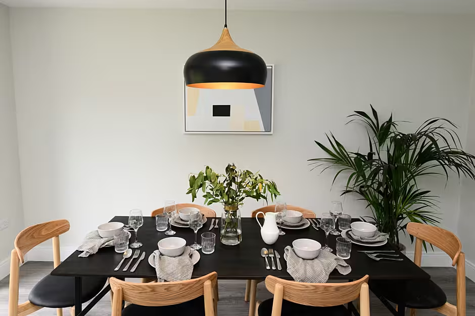
"The kitchen table was sourced from Living & Company and the dining chairs were from Cult Furniture along with the island stools. Table settings were a mix of Ikea and Sostrene Grene. The light fittings were from Cork Lighting.
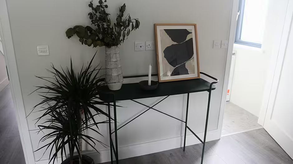
A stylish unit beside the door to the utility room
"The green unit between the utility room and the hallway was from WooDesign and styling items on this were from Zara Home.
"The artwork in the kitchen was from Stone Step Gallery."
The range of artwork is a feature throughout the three show houses, perfectly complimenting their surroundings. Louise explained where they were sourced from.
She said: "One thing we find so important throughout our interiors is artwork and we used a wide range of prints and paintings in Crawford Gate. The prints in this house are from various online stores such as Etsy and Opumo and the artwork in the kitchen is from Stone Step Gallery in Booterstown in Dublin. Maureen McDonnell is an artist and owner of the gallery and creates some amazing pieces.
Moving upstairs, the most eye catching element of the smallest of the bedrooms is the study desk.
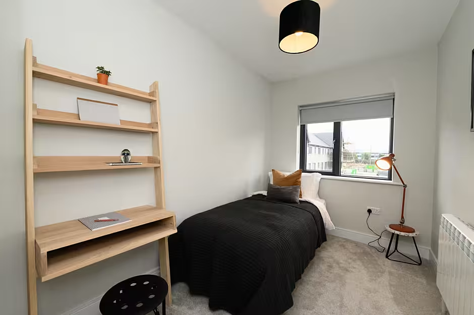
Louise explained where it came from: "The desk in the upstairs teenage room was from Emma an Irish supplier who owns Lamb Design. It being a smaller room we thought it was important to show how this house can both cater for a teenager and toddler/baby. By using this space saving desk it showed how the room can be used to facilitate a bedroom with an area to study."
The kids room is similarly well laid out.
"The kids room was a really nice room to design. It's one for a toddler," said Louise.
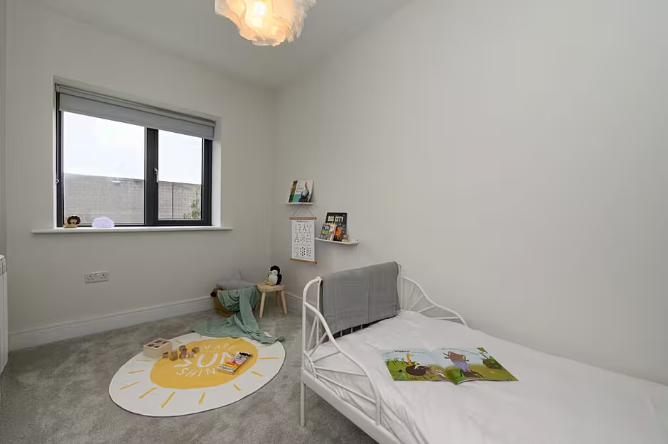
"The bed was from Ikea, teamed with the princess style canopy over the bed which was from Not On The High Street. The play mat is from H&M Home. They have a lot of gorgeous kids bits that are really affordable!"

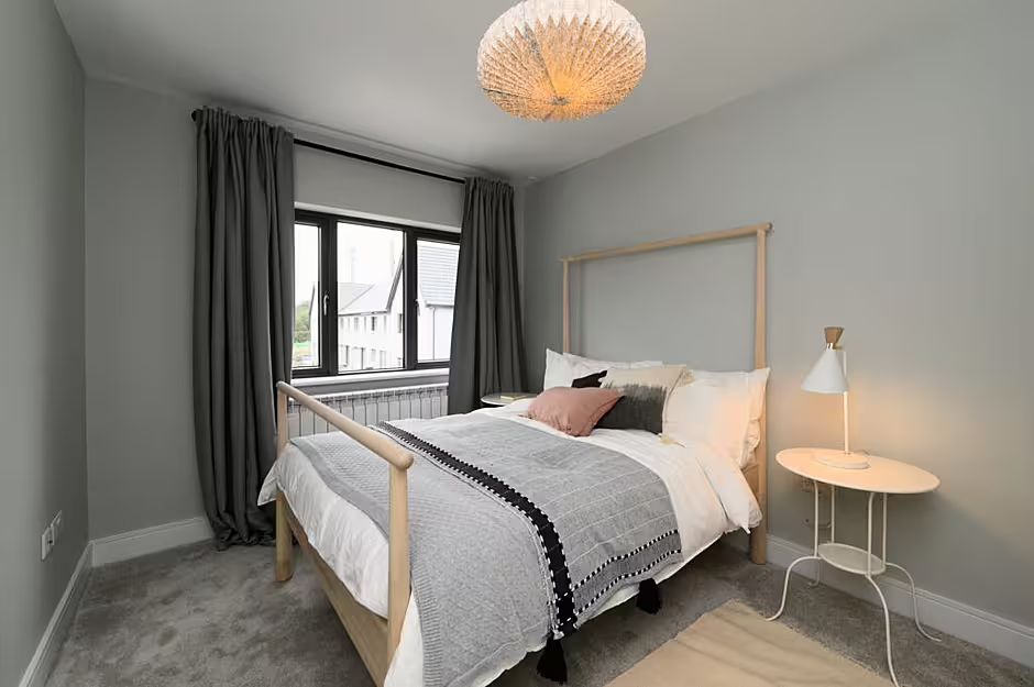
Similarly the two main bedrooms are impressive with the en-suite well finished.
"Most of the bed linen pillowcases and duvet covers are Ikea," explained Lauren.
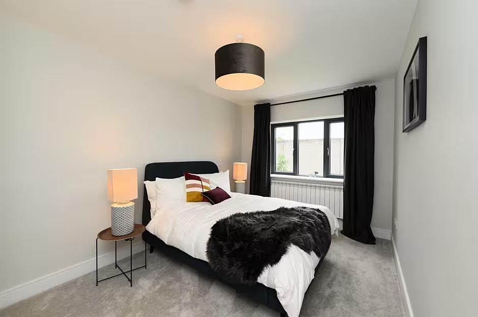
"We teamed them with a mix of throws and cushions from various different suppliers like H&M Home, Zara Home and Dunnes. We find a great way to add colour within a bedroom whilst keeping it bright and airy is to add the colour within the cushions and blankets."
Finally, the bathroom is well finished with the shower supplied and some neat features topping it off. The tiling in the bathrooms is the same throughout all the houses in the 'Hannover Steel'.
The hexagonal mirrors are from Made.com and the round mirrors in the bathrooms are from Zara Home.
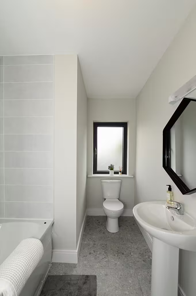
"Both Made and Zara Home are amazing for affordable stylish pieces," said Lauren.
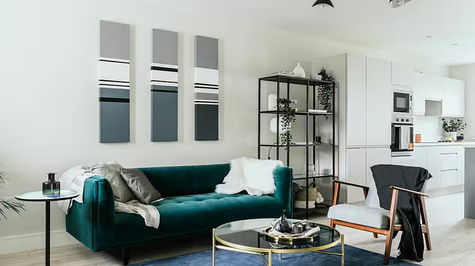
It was then onto the second 3 bed show house where a large open plan living area that blends into the kitchen/dining area is the centre piece. The ground floor flooring is again a laminate flooring 12mm AC5 board in 'Colorado Oak' by Right Price Tiles.
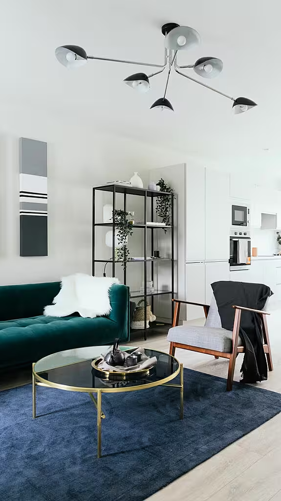
Speaking about this lay-out, Lauren said: "The hallway in this house is limited for space so we added a really large mirror on the wall to the right as you walk in. This opens up the space and bounces the light to make the space feel larger than it is. This is a good trick to display in a show house to show potential buyers what can be done in the hallway to make it seem bigger than it is.
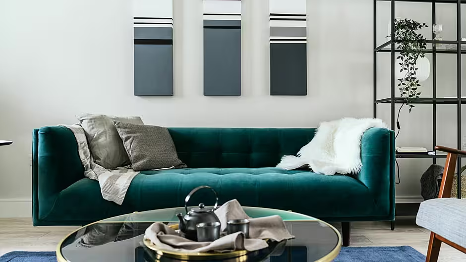
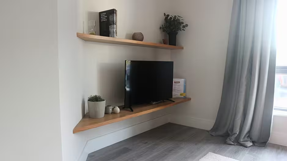
"The shelving unit in the living room is from Bluesuntree and the tv console is from Ikea, along with the black and glass book shelving unit. The large feature artwork over the sofa is by Maureen McDonnell in Stone Step Gallery. The sofa itself is from Made.com.
"All the curtains throughout the houses are from Ikea. A clever hack to make these look fuller is that we bought two packs for each window and got two sewn together for each drape to give the curtains a fuller and more luxurious look.
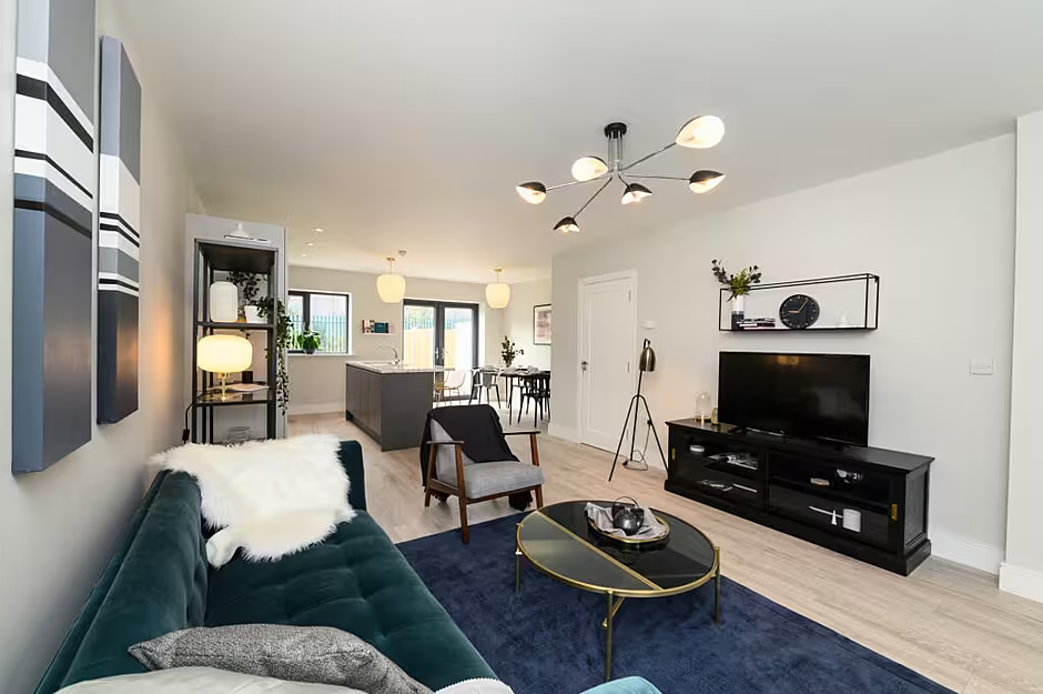
"The rug in the living room, side table and the coffee table are all from Made.com. The side chair is from Ikea while the standing lamp is supplied from Bluesuntree."
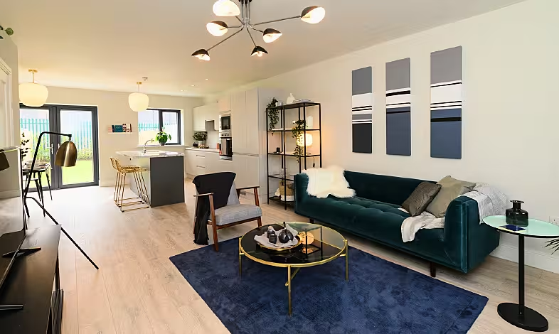
Again a key feature of this house is the spacious kitchen with Louise outlining where the furniture here was purchased from.
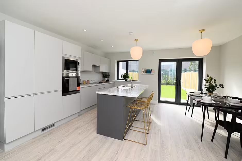
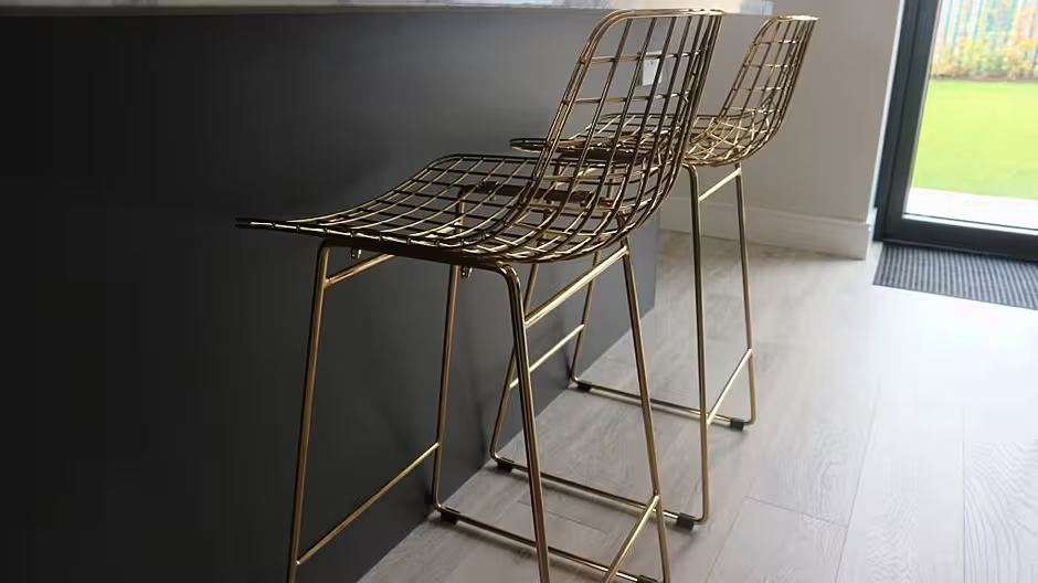
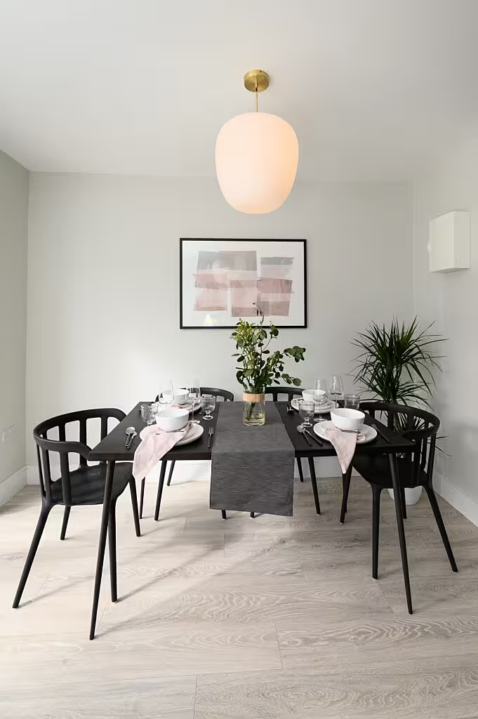
"The kitchen stools were sourced again from Irish supplier Lamb Design. We wanted to add a little bit of brass in this house, as it was the one where we pushed a more edgy design. A little bit more we thought the metal brass stool worked well. The dining table settings again are a mix between Ikea and Sostrene Grene, while the large scale artwork piece to zone the dining area is from IAMFY."
Upstairs along with the bathroom are three bedrooms, divided into a master, spare room and kids room.
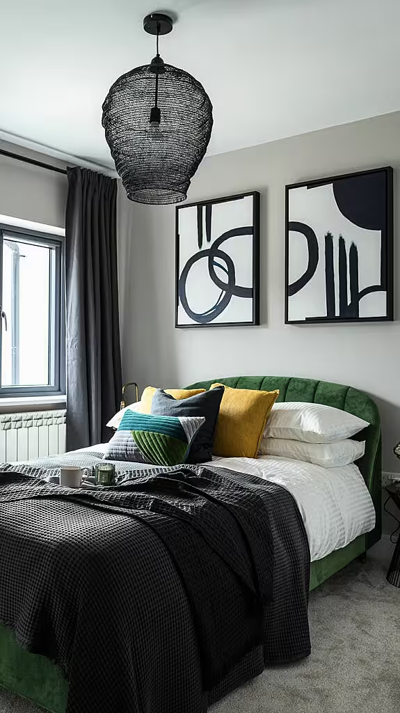
The bed in both the master and spare room are from Made.com. The artwork over the bed in the master bedroom is from Stone Step Gallery while the pendant light fitting is from Living & Company. The side tables and lamps are from Bluesuntree, the bed linen is from Ikea with a mix of made.com and H&M Home for cushions and throws.
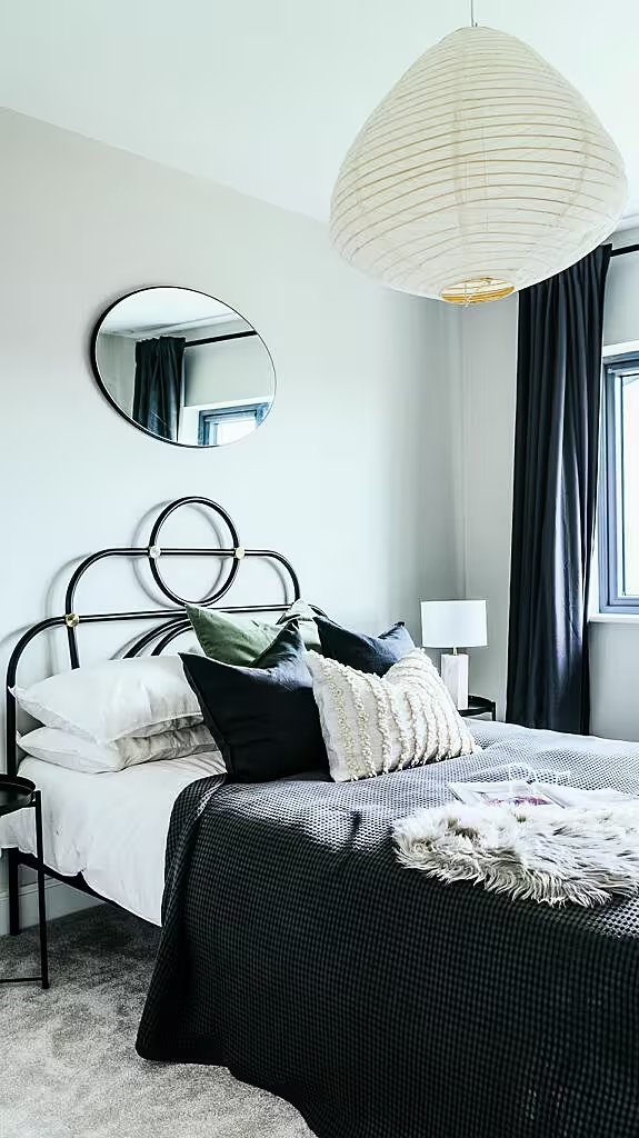
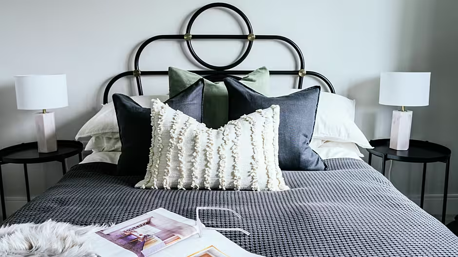
In the spare bedroom the side tables are from Ikea, the bedside lamps and pendant light are from Living & Company, the mirror is from Zara Home while the artwork is once again from Stone Step Gallery.
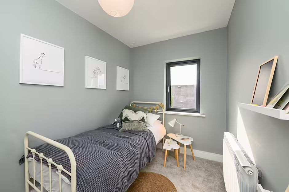
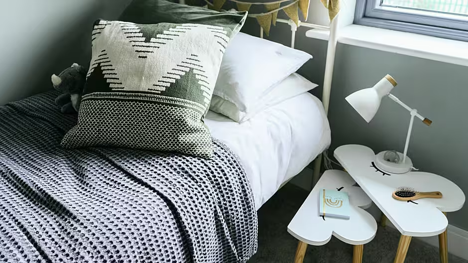
Finally, the kids room's bed was supplied by Mattress Mick with the side tables from Living & Company. The kids prints are from Etsy, the pendant light is from Sostrene Grene. The shelving and frames are from Ikea, the kids rug is from H&M Home and the bedside lamp is from Made.com. The bed linen in this room is from Ikea with the styling cushions and throws from Sostrene Grene and H&M Home.
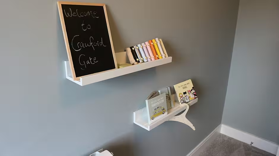
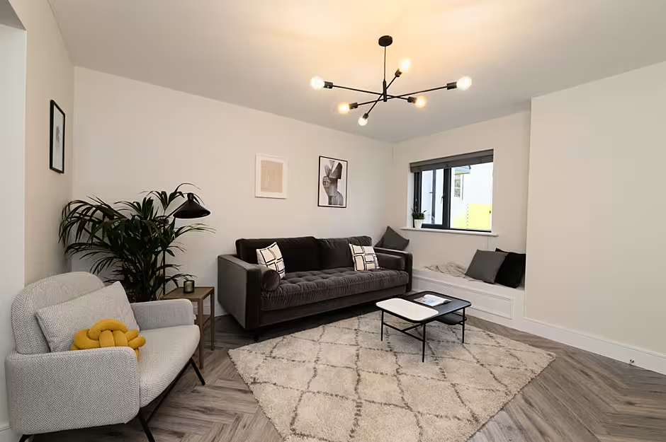
It was then onto the third house which is perhaps the funkiest of the lot. This is perhaps evident from the moment you walk in and look at the flooring, another laminate 12mm AC5 board but in a deeper tone and in the herringbone finish to play on the richness and more traditional feel in this house. The colour is Volcanic Oak Herringbone.
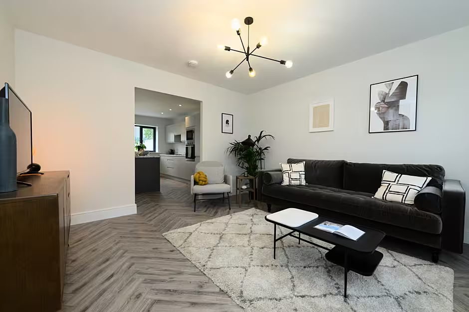
The living room and kitchen are sub-divided here but your attention is immediately drawn to the window seat, designed by North Design.
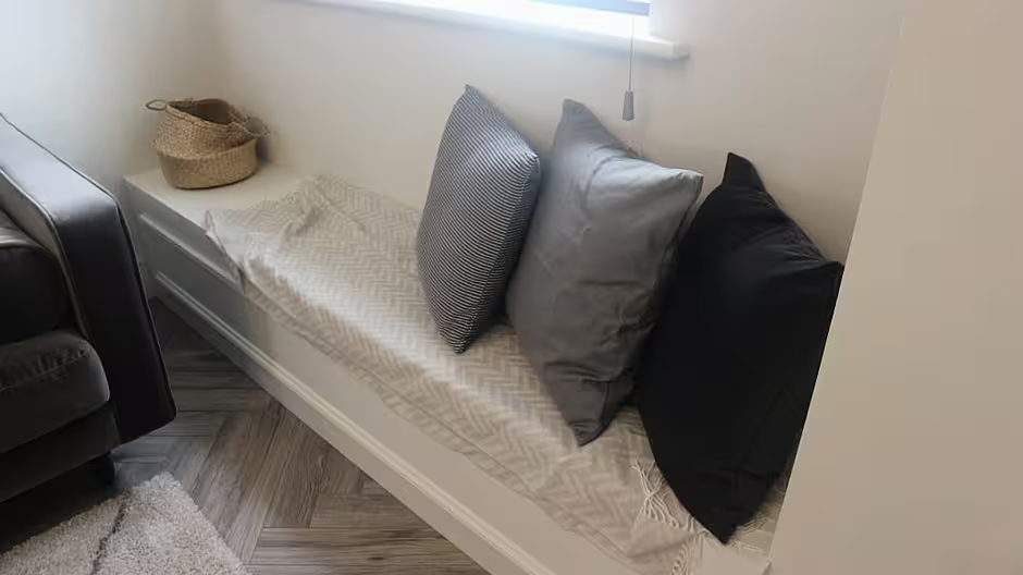
Lauren spoke about it to us: "The window seat was designed by us and manufactured by DOB's joiner.
"The cushions are Zara Home and the throws are H&M Home. The mustard colour knot cushion is from Lamb Design. We love these cushions to add some colour and interest!," she said.
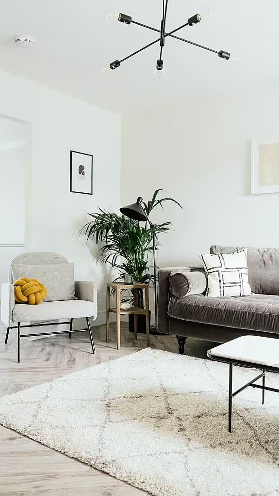
Elsewhere in the living room the shaggy rug is from Modern Rugs, the side console, coffee table and side table are from Swoon Editions and the light fitting is from Cork Lighting. The sofa is from made.com, who also supplied the standing lamp.

Lauren added: "The styling items, vases etc are a mix of Zara Home and H&M Home. The prints are a mix of Etsy and Opumo. Etsy is great for prints, you get a downloadable file which you can print yourself in various different sizes."
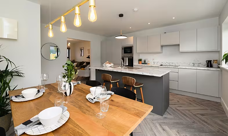
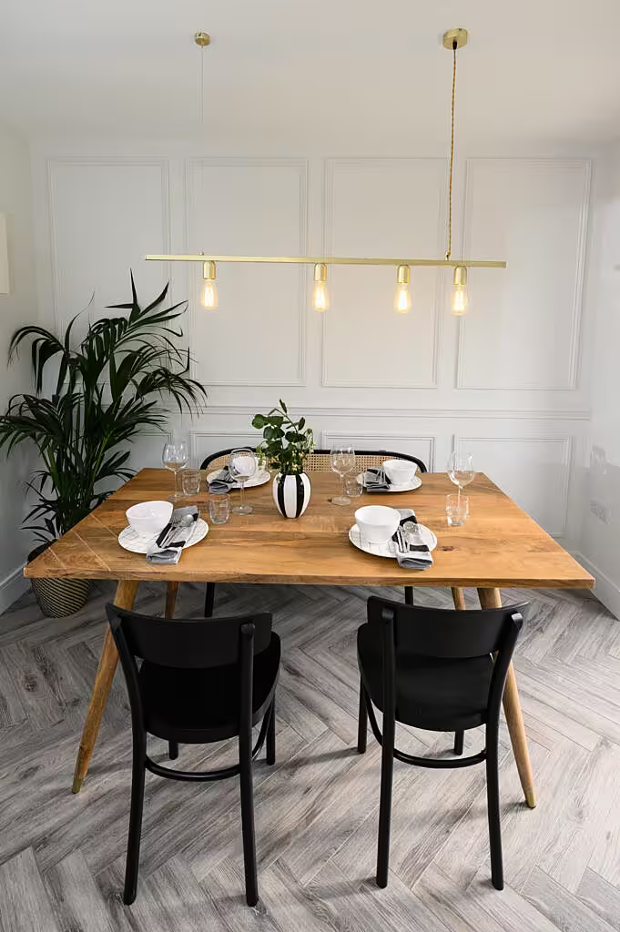
Paneling is a big feature in this house both upstairs and down and it is immediately evident as you enter a kitchen whose feature light over the dining table really stands out.
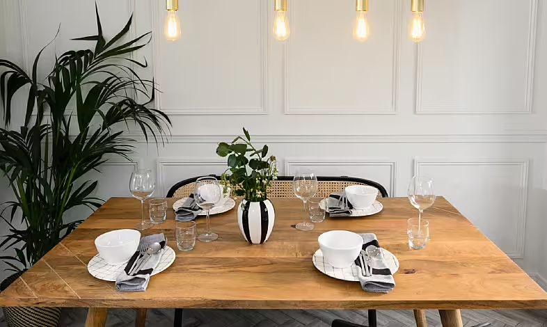
Lauren said: "The paneling was a feature which we love in this room. It adds that traditional touch along with adding depth to the space. The dining chairs are from Ikea and the rattan bench is from Lamb Design. We sourced the dining table from Casey's furniture in Cork while the bar stools are from Made.com.
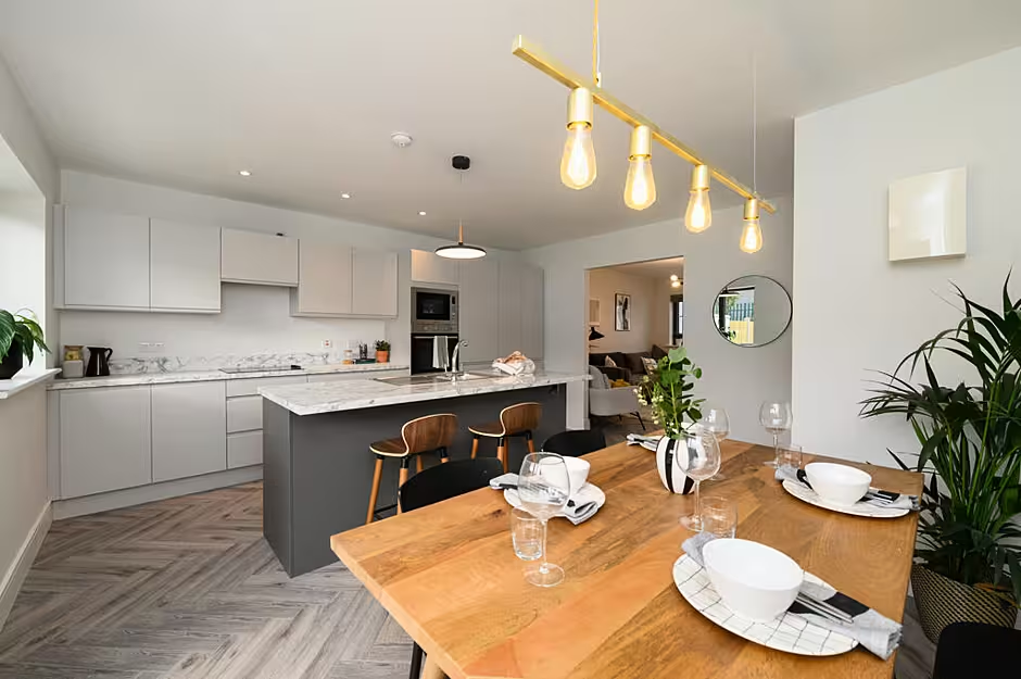
"The light over the dining table is from Etsy. We loved this light as it adds that sleek contemporary touch to the space. The table settings are Zara Home also," she said.
Upstairs and there is further paneling to catch your eye over the bed in the main bedroom.
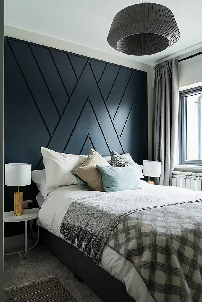
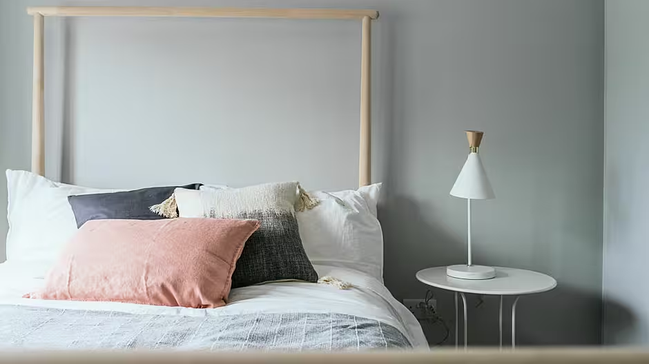
Lauren said: "The panelled headboard was designed by us at North Design and DOB Developments' joiner implemented and manufactured it. It was installed on site and painted by an on site painter. We thought this was a different take on a headboard. We had a lot of bedrooms to design through the three houses so it was important in each master bedroom we had created something completely different.
"The colour of the headboard is Genesis by Colourtrend. We used Colourtrend paints throughout the whole three houses. We love working with Colourtrend as we find their colours and coverage great."
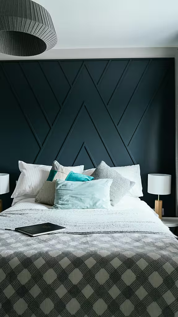
The side tables in the master bedroom are from Living & Company, the curtains and bed linen are from Ikea and the cushions and blankets a mixture of John Lewis and H&M Home. John Lewis also supplied the pendant light.
The paintwork in the kids bedroom is what really sets it up, similar to the paneling in the master.
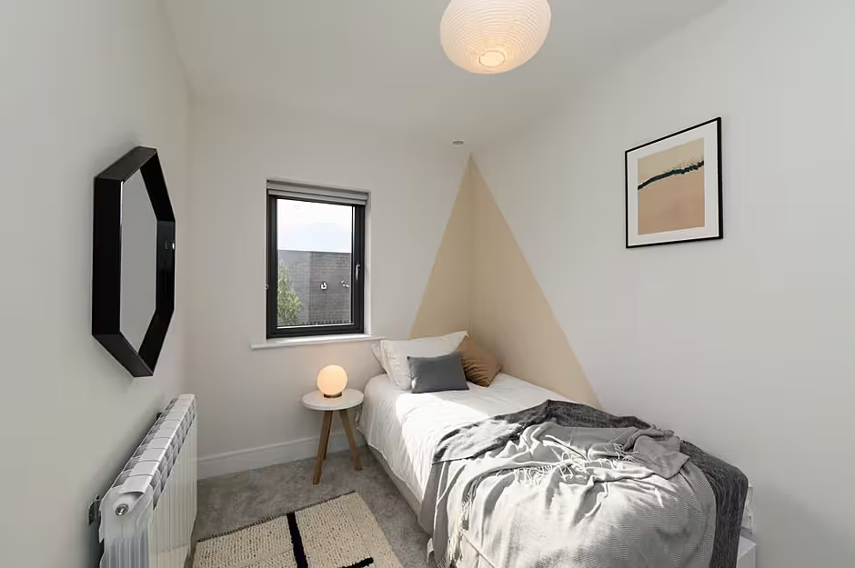
Lauren said: "We did a similar design with the kids bedroom. Instead of buying a bed or a headboard we got an Ikea day-bed and created the headboard on the wall with paint. This creates an interesting space for a children's bedroom, one which can easily be re-created and works well on a budget. The side table in the kids bedroom is from Swoon Editions along with the lamp. The rug is from H&M Home with prints sourced from Etsy, printed and framed by ourselves."
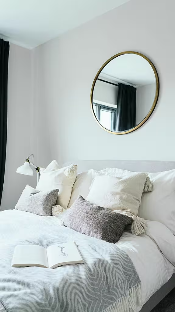
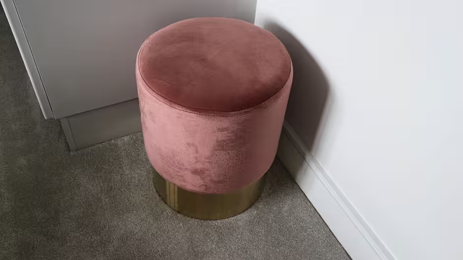
In the spare bedroom the bed was supplied by Made.com with the side tables and pink poof (similar can be found on Cult Furniture) from WooDesign. John Lewis once again supplied the pendant light with the curtains and bed linen from Ikea. The bed styling is a mix of H&M Home, Ikea and Zara Home.
Lauren said the overall process of designing the three show houses was hugely enjoyable for herself and North Design business partner Louise. Jennifer Roe from selling agents Casey & Kingston was also thrilled with their work.
The houses in Crawford Gate ooze style and class
Lauren said: "We didn't necessarily go with any specific theme for each house. We just knew we wanted each of them to be different for potential buyers in order to stand out and remember them by.
"The brief was to target the younger demographic, first time buyers but with that said we didn't want to isolate the potential down-size buyers also by it being too young.
"In the first house we went for quite a bright and inviting feel with earthy tones throughout, this suiting a family with young or older teenage children but also would cater to the idea of down sizers with an allowance to cater for visitors.
"In the second house we pushed the design here a little more, using deeper teal and rich tones with strong artwork by Stone Step Gallery in Booterstown in Dublin. With the introduction of black metal and brass in here it creates a slightly more edgy feel throughout. The design of this house was to be completely open plan on the ground floor, giving the potential buyers a completely different option to the other two houses which are partly or completely closed off.
"The third house was one in which we introduced a little bit more joinery within. This house was the one in which we saw most suitable for the down-sizing market so we wanted to incorporate some more traditional features whilst still keeping a contemporary feel. You can see this within the dining room paneling and the master bedroom headboard."
There is certainly something for everyone at Crawford Gate but perhaps most importantly the simple tips from North Design mean you can quite easily bring a touch of what you see at the Blackrock development to your own home.
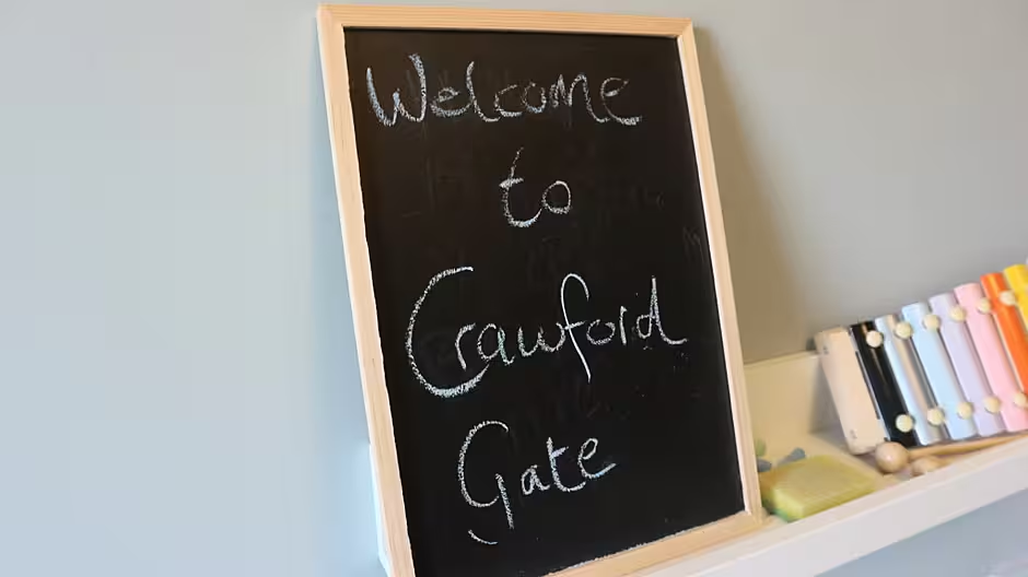
For further information on Crawford Gate check out the development on MyHome.ie here or via the official website www.crawfordgate.ie. You can also find out more about North Design by visiting their website here.
Many of the pictures used in this article are courtesy of DOB Developments / Casey & Kingston / PJ Rankin of Drop in the Ocean
